Don Donel
New member
- Joined
- Dec 19, 2023
- Messages
- 7
- Reaction score
- 4
- Server
- Asia_1
- Main Char
- Don Donel
- Clan
- Not in a clan
Hi all,
I've been fiddling with the Ranger profile UI and noticed two things that could be optimized, maybe.
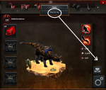
First, two VERY different options are next to each other in the Dinosaurs section. Could 'Destroy' be moved to the bottom right side of the profile instead? We don't want rangers suddenly trashing their dinosaurs, even if accidentally. Granted, many people will be careful about pressing this, but I think we can all agree that wanting to destroy the Dino should be a conscious choice, so we could probably afford to move it down (but still visible). Poor dino, though.
(EDIT: Okay, maybe not specifically where I pointed to, since it's next to the Saddle Up icon also. As long as it's away from the positive/upgrading options.)

Second, this might be a minor thing, but I noticed that implants are easy to remove accidentally. They also block the way of the implants next to them. I wanted to upgrade different implants from this UI, but ended up accidentally removing them from dinosaurs instead of clicking the other implants. Like the previous suggestion, maybe removing implants can be moved downward, or just have a "Remove" word label instead of just the Saddle Up / Install icons alone.

I've been fiddling with the Ranger profile UI and noticed two things that could be optimized, maybe.
First, two VERY different options are next to each other in the Dinosaurs section. Could 'Destroy' be moved to the bottom right side of the profile instead? We don't want rangers suddenly trashing their dinosaurs, even if accidentally. Granted, many people will be careful about pressing this, but I think we can all agree that wanting to destroy the Dino should be a conscious choice, so we could probably afford to move it down (but still visible). Poor dino, though.
(EDIT: Okay, maybe not specifically where I pointed to, since it's next to the Saddle Up icon also. As long as it's away from the positive/upgrading options.)

Second, this might be a minor thing, but I noticed that implants are easy to remove accidentally. They also block the way of the implants next to them. I wanted to upgrade different implants from this UI, but ended up accidentally removing them from dinosaurs instead of clicking the other implants. Like the previous suggestion, maybe removing implants can be moved downward, or just have a "Remove" word label instead of just the Saddle Up / Install icons alone.


